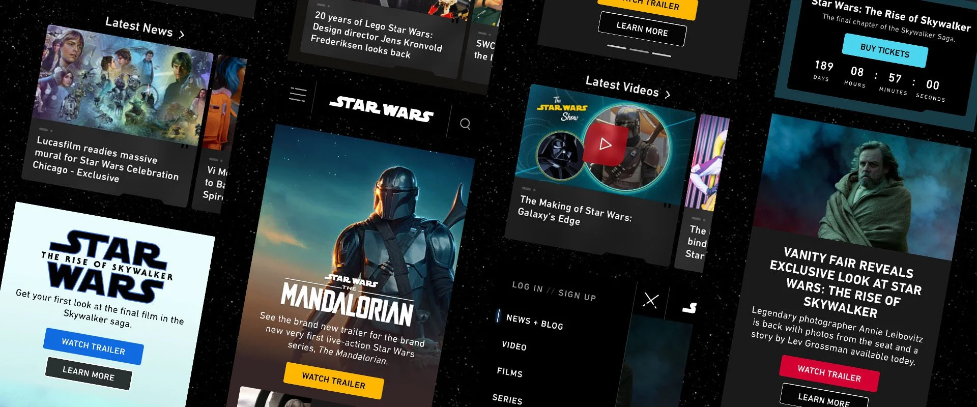
Star Wars.com Redesign
Timeline
8 months
Client
The Star Wars Online Team
UX Researcher, Interaction Designer, Design System Manager
Role
Process
User Analysis, Audit, Wireframing, Design System
PROJECT OVERVIEW
The Problem
At the inception of this project, the Star Wars brand was undergoing a dramatic transformation. Once solely defined by its iconic film series, it was expanding its reach into a vast, interconnected entertainment universe. This evolution presented both challenges and opportunities for the project as it navigated the dynamic landscape of a rapidly growing multimedia franchise.
Because of the evolving Star Wars brand, the existing website design no longer resonated with the modern, dynamic aesthetic associated with the Star Wars brand. Additionally, the content strategy needed to be revamped to showcase the diverse and engaging content available across the Star Wars universe.
The Goal
Our challenge was not simply to give the site a facelift and updated UI but to provide our guests with a meaningful digital experience. Through extensive data-driven research, we created invaluable resources to guide our designs—they are the foundation of the site you see today.
RESEARCH
Using the Force (and data)
Ongoing communication with our web analytics team provided us with valuable user insights, but for the StarWars.com homepage redesign, we sought a deeper understanding. Leveraging the latest user data and behavioral patterns provided by our analytics team, this data served as our north star, guiding the creation of detailed user personas. By meticulously analyzing user engagement metrics, we were able to identify distinct user groups with specific needs and goals. These personas, informed by data-driven insights, became the cornerstone of our design decisions. They ensured that the redesigned homepage catered to the diverse user base and delivered a truly engaging Star Wars experience.
IDEATE
Building the Hyperdrive
While our initial vision encompassed a comprehensive redesign of StarWars.com, the reality of project timelines and resource constraints dictated a more focused approach. We understood that delivering a complete overhaul was not feasible within the given timeframe.
By closely examining the site’s existing structure and user behavior, we were able to pinpoint key opportunities for enhancement. With an understanding of the project’s limitations and goals, we meticulously defined the MVP, outlining the essential features and functionalities required to deliver immediate value to users. This strategic approach ensured that our efforts were concentrated on the most impactful elements of the redesign, setting a solid foundation for future iterations.
A New Hope for the Homepage
To establish a clear path forward, we initiated a collaborative effort with cross-functional teams to identify critical areas for improvement. From the commencement of the project, we partnered with engineering, production, and web analytics teams from the outset to gather a shared understanding of this project. We conducted a live module audit of the following modules:
Navigation & Footer
Hero
Card, Card Slider, & Gumstick
Countdown
Our collaborative approach ensured we maximized our impact within the timeframe. Thanks to everyone’s hard work, we identified seven new modules for StarWars.com.
FINESSE
The Design System Awakens
Prism, Disney’s comprehensive design system, was in its formative stages during the Star Wars.com redesign. This fortuitous alignment presented a unique opportunity to both contribute to the system’s evolution and leverage its foundational elements for a cohesive digital experience. As a result, we were able to rigorously test and implement a substantial portion of Prism’s design components, including a robust iconography system, versatile button styles, a dynamic grid structure, and a comprehensive type ramp. By incorporating these standardized elements, we established a consistent visual language that not only unified the Star Wars.com experience but also aligned seamlessly with the broader Star Wars brand. This strategic approach ensured a harmonious user journey across various platforms and touchpoints, reinforcing the iconic Star Wars aesthetic while laying the groundwork for future digital initiatives.
FINESSE
Off at Lightspeed
Due to our user’s behavior, we prioritized a mobile-first approach. This meant meticulously crafting each user element with clarity and responsiveness in mind. The hero module, acting as the first impression, was designed to be visually arresting on any screen size. We also implemented a dynamic card slider module showcasing featured content, allowing users to effortlessly swipe through news, trailers, or character profiles. The navigation bar and footer were completely revamped, prioritizing intuitive information architecture and ease of use on mobile devices. And the result of our hard work? Seven brand new modules for StarWars.com, a redesigned navigation and footer, and a refresh of the entire site’s visual language—all delivered within the MVP, fostering a deeper connection with the Star Wars galaxy than ever before.
FINESSE
Animating the Galaxy
Our design for StarWars.com wouldn’t be complete without the magic touch of animation. We wanted to populate the site with moments of delight, subtly elevating the website from simply informative to truly immersive. Subtle animations on hover states, for example, could bring iconic Star Wars elements to life – a lightsaber igniting, a TIE fighter zooming by. It wouldn’t be Star Wars if it weren’t for its iconography, so we explored ways to integrate these familiar symbols into animated transitions, subtly guiding users through the various sections of the site. These carefully crafted animations would not only enhance usability but also evoke the thrill and excitement of the Star Wars universe, leaving a lasting impression on every visitor.


